

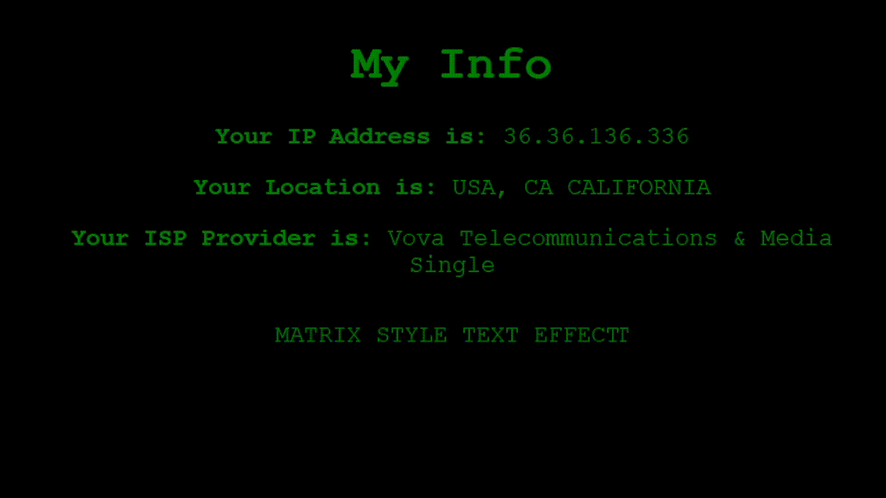
So, this is an HTML file that is designed to display some information about the user, specifically their IP address, location, and ISP provider. The page has a cool Matrix-style text effect that is created using CSS.
<!DOCTYPE html>
<html>
<head>
	<title>My Info</title>
</head>
<body>
	<h1>My Info</h1>
	<p><b>Your IP Address is:</b> <span id="ip"></span></p>
	<p><b>Your Location is:</b> <span id="location"></span></p>
	<p><b>Your ISP Provider is:</b> <span id="isp"></span></p>
	<p id="glitch" data-text="MATRIX STYLE TEXT EFFECT">MATRIX STYLE TEXT EFFECT</p>
</body>
</html>
The CSS styles are defined in the head section of the HTML file. The body style sets the background color to black, text color to green, font to Courier, and font size to 24 pixels. The #glitch style sets the position to relative and the display to inline-block. The #glitch::before and #glitch::after styles create the Matrix-style text effect. They set the content attribute to the value of the data-text attribute of the #glitch element, position it absolutely at the top left of the element, and apply a clip-path to create a triangular shape. Finally, they define the animation using the @keyframes rule.
	<style>
		body {
			background-color: black;
			color: green;
			font-family: Courier, monospace;
			font-size: 24px;
			text-align: center;
			margin-top: 50px;
		}

		#glitch {
			position: relative;
			display: inline-block;
		}

		#glitch::before {
			content: attr(data-text);
			position: absolute;
			top: 0;
			left: 0;
			background-color: black;
			clip-path: polygon(0 0, 100% 0, 100% 100%, 0 100%);
			animation: glitch 2s linear infinite;
		}

		#glitch::after {
			content: attr(data-text);
			position: absolute;
			top: 0;
			left: 0;
			background-color: black;
			clip-path: polygon(0 0, 100% 0, 100% 100%, 0 100%);
			animation: glitch 3s linear infinite;
		}

		@keyframes glitch {
			0% {
				transform: translate(0);
			}
			20% {
				transform: translate(-5px, 5px);
			}
			40% {
				transform: translate(-5px, -5px);
			}
			60% {
				transform: translate(5px, -5px);
			}
			80% {
				transform: translate(5px, 5px);
			}
			100% {
				transform: translate(0);
			}
		}
	</style>
