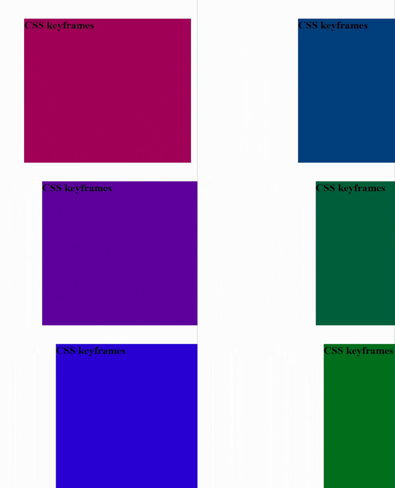
CSS Keyframes Tutorial: Creating Dynamic Animations on Web Pages
CSS keyframes are a powerful tool for creating dynamic animations on web pages. With keyframes, you can specify how an animation should progress over time, allowing you to create complex animations with ease.
To create a CSS keyframe animation, you need to define the keyframes using the @keyframes rule. This rule specifies the name of the animation and the keyframes that make up the animation. Here's a basic example:
@keyframes example {
  from {background-color: red;}
  to {background-color: blue;}
}
In this example, the @keyframes rule defines an animation called "example" that starts with a red background and ends with a blue background. The from and to keywords specify the starting and ending keyframes of the animation.
Once you have defined your keyframes, you can apply them to an element using the animation property. Here's an example:
div {
  animation-name: example;
  animation-duration: 2s;
}
In this example, we apply the "example" animation to a div element using the animation-name property. We also specify the duration of the animation using the animation-duration property.
Now let's take a closer look at how keyframes work. Keyframes allow you to specify different styles for an element at different points in time. For example, you could create an animation that starts with an element at 0% opacity and ends with the element at 100% opacity. Here's an example:
@keyframes fade-in {
  0% {opacity: 0;}
  100% {opacity: 1;}
}

div {
  animation-name: fade-in;
  animation-duration: 2s;
}
In this example, we define an animation called "fade-in" that starts with an element at 0% opacity and ends with the element at 100% opacity. We apply the animation to a div element using the animation-name property.
You can also use keyframes to create more complex animations. For example, you could create an animation that moves an element across the screen while changing its color. Here's an example:
@keyframes move-and-color {
  0% {background-color: red; transform: translateX(0);}
  50% {background-color: blue; transform: translateX(100px);}
  100% {background-color: green; transform: translateX(200px);}
}

div {
  animation-name: move-and-color;
  animation-duration: 4s;
  animation-iteration-count: infinite;
  animation-timing-function: ease-in-out;
}
In this example, we define an animation called "move-and-color" that changes the background color of an element and moves it across the screen. We apply the animation to a div element using the animation-name, animation-duration, animation-iteration-count, and animation-timing-function properties.
The animation-iteration-count property specifies how many times the animation should repeat (in this case, it will repeat infinitely), and the animation-timing-function property specifies how the animation should progress over time (in this case, it will start slowly, speed up in the middle, and slow down at the end).
In conclusion, CSS keyframes are a powerful tool for creating dynamic animations on web pages. By defining keyframes with the @keyframes rule and applying them to elements using the animation property, you can create complex animations that enhance the user experience. With a little practice and experimentation, you can use keyframes to bring your web pages to life.


